Posted on

From the Author’s Desk: How do you know it’s time to update your covers? 

Covers are a tricky business. I’m a writer, someone who works well with words and characters and dialogue. Graphic design is not my strength in any way, and my art skills peaked with stick figures. I am not the person to ask about cover design, but even with my shortcomings, I still know a few things about covers and marketing. 

You know the drill–your books come out, and you are super excited about those first covers. They nail the genre, convey the feeling of the story, and look cool on your shelf (or behind you during meetings online). Usually, this is the result of your cover designer’s hard work–they researched the market, considered the trends, and created something you are proud to show off atop your baby book. 

However, the crazy (and cool?) thing about books is how often things shift. A bestselling cover ages out, sometimes in a few years–but sometimes over a span of a few months. When you design your covers, think about how long you predict this trend will last. Yes, this often requires a crystal ball and some scrying stones–but there are some people in the industry who have the marketing sense and judgment. Follow them and heed their advice. 

Think about the shifts in these covers for Stephen King’s The Stand over the years:

This is the cover I had when I first read this book in the 80s (a tattered secondhand shop version I hid in my backpack to read at school). Yes, I now know this version is worth money (it was the first edition!), but mine has long been lost to cross-country moves and bookshelf updates. No worries–I now have more copies of this book than I know what to do with, the result of writing my dissertation on it–people keep giving me copies (and I LOVE all of them!).

Here are a few more over the years:

Think about how these have shifted. The fonts have changed, though the name is always at the top. The graphics shift from artwork to abstract to realistic. They each convey a slightly different tone: some focusing on the post-apocalyptic feel while others emphasize the horror undercurrent. 

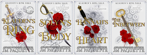
My own series, Klauden’s Ring Saga, just got re-released with new covers, and it’s only been out five years! Check out the difference between the old covers and the new:

Note the changes: no more people! Less vibrant color shifts! The new covers follow current trends for fantasy romance, symbols buried amid swirls and designs. 

How can you tell when it’s time to update your covers? I’m glad you asked. 

  1. Look at the top 100 bestsellers in your category on Amazon. Scroll the covers–they will probably all be quite similar. Does your book match that vibe? 
  2. Do a google search for your genre + book covers. Does your cover look anything like the images popping up? 
  3. Watch reels about your genre on social media. Does your book resemble the ones you keep seeing?

If the answer to these questions is no, it’s time for a new look. Yes, I know it’s time-consuming and expensive to redo your covers (not to mention the stack of old covers you probably still have to sell!), but keeping up with trends in your genre is a great way to stay relevant and catch the attention of new readers. 

And what to do with old stock? So many options!

  1. Sell them at a discount at shows (“Get the old version on the cheap!”)
  2. Wrap them up and call them “Blind Dates” with a book!
  3. Send them to readers–prizes, free copies, review exchanges, etc. 
  4. Offer them to libraries or local community centers.

Any of these will get your name out there–and get new readers buying the rest of your books! I know we say, “Don’t judge a book by its cover,” but we all do it. Don’t let readers pass you by because of an outdated look. Update your covers!

Posted on

4 Must Haves for Covers to Land in Book Stores

It’s every authors’ dream to see their book on the book shelf at a local store. In fact, there’s something awe-inspiring when it lands on a shelf at a large retailer such as Barnes & Noble. With the publishing industry rapidly evolving, even the self published author has a chance to achieve this. Traditional publishing is no longer the only path to allow this dream to come true, but there’s a lot of factors that impact how successful your attempt will be. You have to have the right distribution channels, a book genre they are needing to fill the space for, register the title in such a way, and more importantly, design your book can be the difference between a hard no and getting that yes.

We hear the adage of “don’t judge a book by its cover” all the time, however, in the world of selling and marketing, this is the first point of contact. Your cover has 3 seconds to grasp an amazon customer’s attention as a thumbnail, but that’s for digital sales. When it comes to landing on a bookshelf things get more complicated. Stores have needs, stipulations, and more that if the book’s design doesn’t meet these, you won’t get that dream locale.

1. Be On Trend

The most apparent aspect is making sure your book matches the trends. This means even considering changing your cover as the hot trends in your book’s genre and audience as they evolve. You see even the bigger publishers do this for books such as Stephen King’s The Stand with covers evolving in several ways. You’ll find his name grows larger with his popularity, that variation covers for television and movie adaptations, and even recent remakes to match current trends. In short, as much as you loved the art or that cover, you can’t keep your book competitive by settling on one version and hope that the trend stays. In short, your cover needs to sell to today’s readers, not yesteryear’s fans. It has to compete and be on the same level as the big publishers, so don’t be afraid to find a cover designer that can take this to the next level and this may come down to forfeiting your initial vision for the cover completely.

2. Spine Text

As 4 Horsemen Publications steps deep into year four of being in business, it’s surprising to see the gap in what readers are buying and what traditional says is expected for books in regards to word count and book lengths. Overall, books pushing over 80,000 words in all genres sell better. With that in mind, books with a 5×8 to 6×9 book size, or trim size, will have the spine width needed to have room to place spine text. If your book doesn’t have title, author, imprint logo, and series number (on top preferably) – your book won’t be considered for in-person shelf placement. That’s right, because they need the readers to be able to see what book that is among the sea of books, and added bonus if at a glance they know which in the series it is. Even the library system wants to see this more on books they carry! I can’t express how important it is for them to be able to shelve the 

3. Barcode Placement

Did you know there’s a book group in charge of regulating what a book barcode looks like? Every book in the market has the same barcode pattern and now large retailers including Amazon are demanding in 2023 that print books, paperback and hardcover, have the barcode on the back cover always in the bottom right corner. Why? Because automation is king and the more consistent and standard these are the easier to process large volumes of books. Your barcode consists of ISBN, or International Standard Book Number, as well as your book’s price. Barnes & Noble and many large retailers make it clear in the fineprint that they only carry books who have the price listed on the barcode. For example, 52299 on a barcode indicates USD, or US dollars with the 5 followed by $22.99 price. If your code says 90000, this means no price is listed and this book will have a hard time landing at brick and mortar stores.

4. Leveling Up

Don’t stop with the basic shelf needs! Be sure to take advantage of the cover and look at the trends for your genre. If you have a non-fiction book, you will be making space for the author’s short bio alongside the blurb so readers know why they are the best expert about their topic of choice. Regardless, every publisher and author should be using this space to add a modern touch and include not only website information but social media. With author platforms being number two in the best way readers discover new authors and books for over a decade, don’t leave it out (Statistics from Ingram, Written Word Media, BookBaby, etc.)! Make sure to add your book award seals, quotes or one liners from reviews, and “foreword by” are all great additions to catch the reader’s attention and connect.