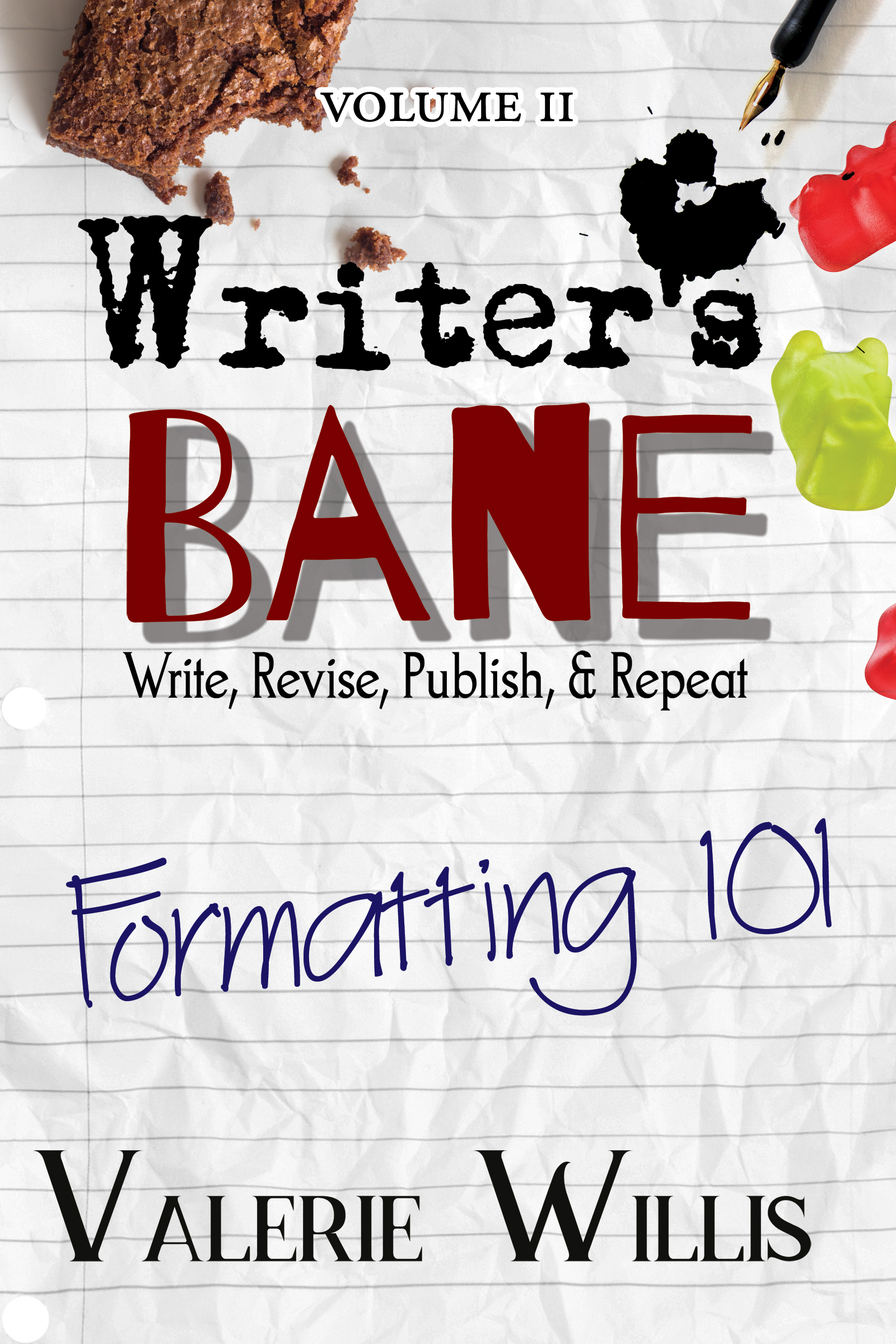
It’s strange to think about the fact that book formatting and layout still shows signs of those early printing press books in the 1400-1500s. Over the centuries, academia has evolved that format to create standards that began to take hold as public consumption increased in the 1800s. Regardless, your book’s format has to fall in line in a lot of ways for several reasons which include guiding and navigation of content, pacing of a story, placement on bookshelves, limit print issues, and reader immersion. If you haven’t discovered Writer’s Bane: Formatting 101, you’ve been missing out on a lot of answers to questions and even a stronger understanding of how impactful formatting is on a book. This includes what goes inside your book, how to prepare a manuscript for a typeset, and how to design the interior of your book.
Guiding and Navigation of Content
Imagine a world where books didn’t have an expected chronological order to the content presented. I mean, no chapter numbers, no headers, and no page numbers. PURE CHAOS! A book’s format has an expected order and rhyme and reason. If they didn’t, it would be impossible to grasp where the information can be found. Even in “Choose Your Own Path” novels they have clearly written instructions and rely on guiding a reader via the page numbers. Let’s also be mindful that, for example, page numbers should land in the same spot throughout a book, but if this was inconsistent, you would be lost especially in a textbook.
Keeping these navigational devices in your book in place and consistent means a lot. There have been a few books where page numbers were non-existent, and with so much automation in even word processors, WHY? How am I supposed to know where I am and what page my bookmark fell out? CHAOS. And worse, this example had a Table of Contents with numbers. PURE CHAOS. Be mindful of using all the navigational tools not for you, but your readers.
Pacing of a Story
This starts at the manuscript level and can skew how a typesetter or book designer “translates” the final book format, but be sure to use double returns and marking line breaks (***, #, or some other consistent searchable indication) in the right way.
For example, double returns often come into play when a flashback starts or ends, a change in point of view or head hop happens in the moment or scene with no jump in time, or in non-fiction change in thought or moving on to the next thought within the same subject matter for that section/chapter.
As for the line break, this is often where an ornamental icon will be added into a book. These often signal a change or passing of time in fiction work, change in location or jumping to a character not in the current scene, or the start of a new subject matter in a more significant manner in non-fiction.
Placing these consistently and using them for the age-old expected reasons can help how a reader and story paces visually and limit any confusion. Imagine if neither of these existed in the novel you’ve been reading? MAYHEM!
Placement on Bookshelves
If you fail to fall in line with CMS or similar styling (Chicago Manual Style, APA, MLA, ect.), there’s a good chance that your book will not be chosen for bookshelves in commercial stores, libraries, and schools. It’s not uncommon for schools to require books to be in APA for medical books and degrees while other textbooks on certain matters for researched content may want MLA. Overall, commercial or public consumption often falls under the CMS standards though they aren’t as strict as academic and textbooks can be. These tend to be far more artful and allow more creative means. That doesn’t mean go hog wild and go above-and-beyond to break the formatting until it’s no longer recognizable. We’ve spent centuries to develop these styles and for good reason.
Limit Print Issues
Margins and layout are also defined under these styles. Not only does it help identify the anatomy of what’s on the page, but these often aid in keeping the content from printing off the page or deeping into the spine of the book. Headers and footers play dangerously close to the edge, but the core content never should come close to this. The information is far more vital if the page prints crooked, right? Often book designers will have to adjust the margins dependent on the printer and press they are sending the file too. For example, for a perfect binding or glue binding Print-on-Demand book we typically set the inner margin with no bleed. Meanwhile, for Smythe Sewn or sew-bound hardcovers we would have to add bleed/trim/margin for stitching and binding to take place. A lot of math gets involved in those final moments of a book’s design that can impact the final look, so be mindful that anything that is pushed to the edge or super close has a high potential of “being lost” or cut off completely.
Reader Immersion
Lastly, the biggest factor in all of this is the impact your consistency in formatting has on the reader. If the styling and broken style rules are too many, the reader will be confused and most likely will stop reading or even abandon the book. Again, for CENTURIES, books have an order and cadence that readers for GENERATIONS have been taught to read. Breaking the normal expectation in certain umbrellas can have detrimental effects to how readers feel and perceive your book and its content. Bad reviews, low sales, and social media thrashing will be just a few of the impacts here. The way a book is formatted is designed to optimize COMMUNICATION and to alter that has dire consequences and breaks the connection with the readers. Immersion can be granted, but the moment the font changes without warning, or the content isn’t labeled as expected, the reader gets distracted or frustrated. Remember, you’re not formatting for you, but for the audience. Don’t cause chaos!
Discover More
Like the advice and information you see here? Check out the Formatting 101 textbook here at: https://4horsemenpublications.com/product/writers-bane-formatting-101/ . This book holds a variety of answers for those seeking to become typesetters, looking to self-publish their book, or simply want to learn how to communicate and prepare their manuscripts to get the most out of their designers. The Writer’s Bane is a curse and passion, both a want and need to tell a story. In this volume, you will learn the importance of preparing a book for layout as well as laying it out in a way that appeals to your readers of any genre including picture books, chapter books, fiction, memoirs, textbooks, workbooks, and everything in-between.